Logo 2021

Our first logo from 2014 was made by Coral Hernandez Finol. As an illustrator, Coral worked for brands like Betsey Johnson, Santoro London, Puig and Zara. She has developed her passion for the indigenous people in her hometown of Maracaibo. A place with the densest indigenous people in the north of South America. The brief was to illustrate Mother Earth! Since we work mostly with Wayuu people, Coral created an indigenous woman with the traditional Wayuu face painting.
![]()
In 2021 we longed to update this version towards a more elegant look. As pretty as this logo was, it felt a bit childish. We had started to use organic certified GOTS materials for good and work with a stronger fashion angle. This evolution needed to be reflected on the logo as well. The journey to reach the new logo was long though.
First we worked with Elif an illustrator in Turkey, since we loved her previous work. The logos were great, but they didn’t feel right. Our members longed for the indigenous woman that inspires us every day to keep on working.


As next step, we briefed our Venezuelan graphic designer Alcides Barboza, who has extensive experience in so many types of illustrations, logos and printed material. However, we didn’t come to an agreement about the visual.


Finally, we asked Patrizia Stalder, if she would design our logo. Since Patrizia had done so much pro bono work creating most of our designs for the past two collections, we felt quite shy to ask. She of course accepted right away and helped us to create the cutest boho logo ever! Patrizia’s illustrations have been included in the “200 Best Illustrators Worldwide 18/19” publication by Lürzers Archiv. Lürzer’s Archiv presents creatively outstanding campaigns from all over the world and enjoys a high reputation in many countries. Patrizia’s career has taken her all around the world. In Havana, Cuba, the Basel artist studied drawing at the Instituto Superior de Arte and worked in Los Angeles as illustrator and in Basel as Art Director. Her work is influenced by her naturalistic drawing studies and her love for graphic abstraction.
Below you can see the evolution of Mama Tierra’s current logo.
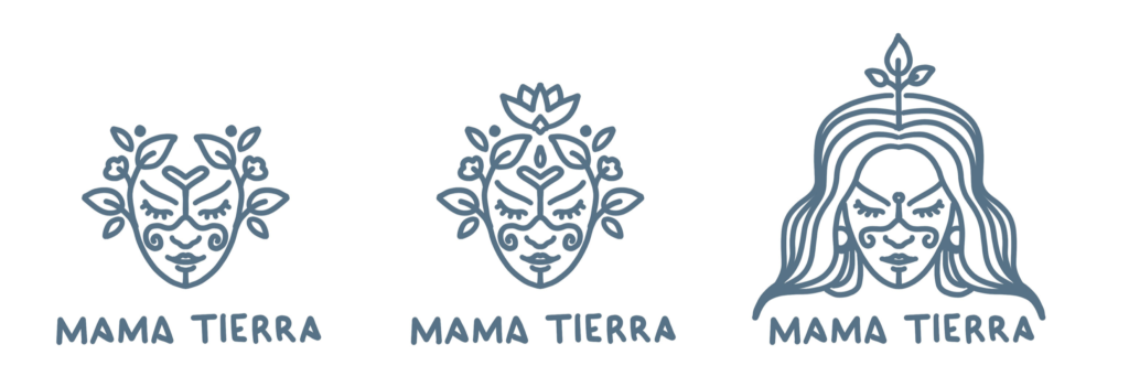

We loved these versions, but we were not sure what head decor we should keep. The butterfly gives a such beautiful message of transformation and spirituality but it was difficult to have printed on small surfaces.

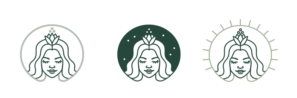
Final logo, hurray!
